Creating an effective website is a key factor of success. A well-designed website can attract and keep visitors, whereas a badly designed one can drive them away.
Creating an effective website is a key factor of success. A well-designed website can attract and keep visitors, whereas a badly designed one can drive them away. In this article we will introduce useful tips for effective web design.
The user experience is the foundation of every site. If a user does not like your site or cannot find their way around it, they will leave. Do you not know everything the abbreviation UX covers? Find out what UX design is and why it matters so much when creating a website.
Simple navigation
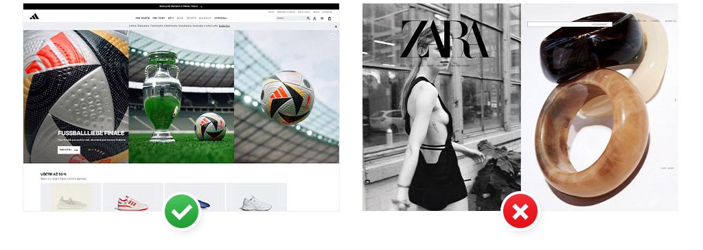
The main menu should be clear and well arranged and the categories comprehensibly labelled. An intuitive site lets users find the products or information they need easily.
Examples from adidas.sk and zara.com:
Page loading speed
The ideal loading time for a good website is less than 2 seconds. If it loads longer, the likelihood of users leaving the site rises. Neil Patel even reports that a delay of 1 - 2 seconds can lower the conversion rate by 7%!
A long loading time can be caused by various things, one of them being image files that are too large. The tool TinyPNG lets you compress images without damaging their quality, which raises the site's loading speed.
Responsive design
Optimise the website for various devices and pay particular attention to mobile devices. As early as 2022 mobile web traffic reached almost 59%, so an effective mobile interface is a must today.
Visual hierarchy and legibility
A proper visual hierarchy helps users grasp quickly what matters on the page. Use contrast, font size and the arrangement of elements on the page to highlight key information.
Contrast and colours
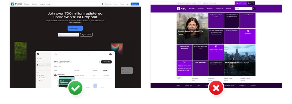
Use contrasting colours. If the type does not have enough contrast against the background, the user will have trouble reading. Do you want to be sure your text is always easy to read? Use the Color Contrast Checker tool to work out suitable contrast.
Using colours has its rules too. The most striking colour on your website should belong to the CTA (call-to-action) button, which motivates the user to take the desired action. If there were too much of this colour on the site, it would lose its "importance" for the user and they would not know what to focus on.
Examples from dropbox.com and nyu.edu:
Typography
Choose an easily legible typeface. In print a serif face (Times New Roman, for instance) is more agreeable to the eye, but online sans-serif faces are the first choice. Among our favourites are fonts such as Roboto, Open Sans and Poppins, which you will find free on Google Fonts. Besides the right font, watch the size too - for the text to be easily legible the font has to be at least 16 px.
Examples from roxanegay.com and suzannecollinsbooks.com:
White space
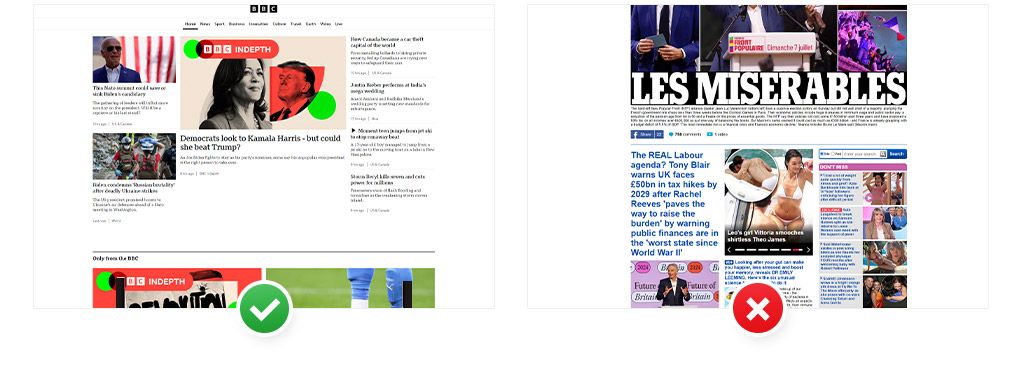
Do not be afraid to use empty space. White space, or negative space, is the term for a deliberately left empty area on a website. Its primary function is to separate blocks of text, thanks to which the content feels more natural and airier. Besides that it can arrange the content so that its most important parts stand out, or raise the user experience.
Examples from bbc.com and dailymail.co.uk:
Quality content
Content is the heart of your site. Without quality content not even the best design can save your site. Make sure it is relevant, interesting and well structured.
Clear, apt copy: write concisely and aptly. Bullet points and short paragraphs markedly improve legibility.
Multimedia content: images, videos and infographics help user engagement. Not only are articles with such content more visually appealing, they also create room for better understanding of more complex data.
SEO optimisation: use keywords relevant to your content.
Consistency is essential for building trust and brand recognition. Your site should clearly represent the brand's corporate identity.
Brand colours
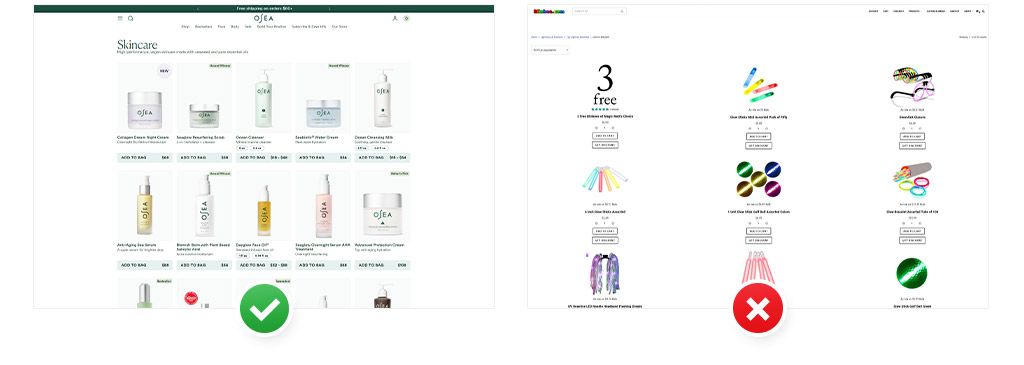
At the very start choose one primary, dominant colour that will be used most often. Add 2 - 3 secondary colours to it that complement the main colour and create visual harmony. By using these colours on the site and on products you create a strong, unified visual identity.
Examples from oseamalibu.com and blinkee.com:
Communication style
Keep the same tone and style of communication in all the site's copy, and on social media too. Decide whether you want to come across as friendly and informal, or rather more serious and formal.
Graphic elements
Use consistent visual elements - icons, buttons, images and illustrations. Define a certain style and decide whether you will use sharp or rounded corners, which icon set you will choose and what images you will communicate your brand with.
Testing and optimisation
A website is not a one-off matter. The key to long-term success is constant testing and optimisation.
Feedback
Listen to your users. Gather feedback through questionnaires, reviews or direct conversations. Ask people you know to help you with testing. Watch how they react to the site, whether they can find their way around it easily or need help. What is clear to you may be hard for others to find.
Analytics
Use Google Analytics. With it you can track metrics such as bounce rate, time spent on the page or conversion rates.
Do not forget that web design is a dynamic process and there is no single set of instructions for it. Follow new trends and technologies, adapt to your users' needs and keep looking for ways to improve your site.
Recommended reading
The latest trends, proven practices and analyses from the digital world. Find out how to take your technology and marketing growth further.